This year brings bold new directions for apartment website design. Today’s renters crave immersive experiences, authentic connections and a taste of what life in your communities truly offers.
By incorporating the latest design trends, your website can transform from a static brochure into a magnet for potential residents.
Keep reading to discover the design trends that will make your apartment website stand out. Since design incorporates both form and function, we’ve divided them into style trends and engagement trends. Get ready to embrace vibrant colors, playful interactivity and a touch of nostalgia, all while ensuring your website remains user-friendly and accessible.
Many of these website design elements are already available within RentCafe website themes. As an added bonus for readers who have RentCafe websites, we’ve included some platform-specific examples too.
Style trends
Before diving into specific style trends, it’s important to remember that the overall goal is to create a website that reflects your unique brand. Your design should resonate with your target audience and create a clear picture of the lifestyle you offer.
With that in mind, let’s explore four style trends that will be big in 2024: gradients, maximalism, brutalism and Y2K aesthetics. Each offers a distinct way to showcase your personality and grab attention but remember to choose the one that best aligns with your brand identity and target audience.
Gradients
Remember the eye-catching gradients of the 90s? They’re back, but with a modern twist. Gradients add depth and personality to your website while guiding users’ eyes towards important information.Think subtle color shifts in backgrounds, buttons or calls to action.
It’s important to avoid overwhelming users with overly complex or clashing gradients. Invigorating is fine, but stressful is not.
See a RentCafe Website theme with a gradient
Maximalism & patterns
Minimalism will always have a place in good design, but this year, maximalism is in the spotlight. Embrace rich color palettes, bold patterns and expressive typography to create websites that get renters excited about your communities.
Don’t be afraid to mix patterns and colors — but remember to use white space strategically to avoid visual clutter.
See a client’s apartment website with a lot of patterns
Y2K aesthetics

Remember the fun and funky vibes of the Y2K era? They’re back with a vengeance! Think playful fonts, retro illustrations and even a touch of static noise. This trend evokes nostalgia and adds a lighthearted touch to your website.
Is it right for everyone? Probably not. But if you have properties geared toward students or young professionals, Y2K aesthetics could be a strategic choice to bring freshness to your website. Our advice? If you’re using it on your website, make sure you update your social media profiles to match.
Brutalism
Providing a sharp contrast to maximalism, brutalism is an emerging design trend impacting both websites and interior design. Inspired by raw concrete architecture, it embraces exposed elements and unfinished textures.
This trend might not be for everyone, but it can work for modern, industrial-style apartments. Remember, balance is the key to making this design style work. Pair brutalist elements with softer touches to avoid an overly stark feel.
See a client’s corporate website that pairs brutalist elements with warm colors and script fonts
Engagement trends
In marketing, you know you can’t afford to wait passively for user interaction. We love calls to action in this business. Apartment websites need to be dynamic and engaging, encouraging visitors to explore, learn and ultimately take the step to convert into residents.
This section explores three engagement trends that are likely to catch renters’ attention: micro animations, interactive buttons and gamified design.
Micro animations
Micro animations are subtle movements that add life and personality to your website. Think buttons that morph when hovered over, text that animates as users scroll and progress bars that track your activity toward a specific goal. These small details enhance user experience and make your website more engaging.
See an apartment website homepage with animations as you scroll
Interactive buttons

Forget standard buttons! In 2024, it’s all about interactive buttons that change color, shape or even animate upon interaction. This adds a playful touch and encourages users to explore your website further.
Just remember to ensure interactive buttons don’t distract from essential information. They shouldn’t be reminiscent of those terrible digital ads from the late 90s that flashed and blinked and should’ve come with seizure warnings.
See a homepage with two styles of interactive buttons
Check out a RentCafe theme with a different style of interactive buttons
Gamified design

Gamification leverages game-like elements like points, badges and challenges to incentivize user engagement. Imagine apartment feature quizzes, interactive floor plan selectors and referral programs with rewards.
Gamification can increase interaction, collect valuable user data and make your website a truly memorable place to find a home.
Try out the gamified floor plan assistant with RentCafe Websites
Ready to attract & convert renters with a cutting-edge apartment website?
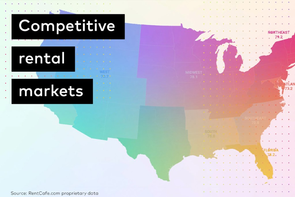
In today’s competitive rental market, standing out is crucial. By incorporating these design and engagement trends, your apartment website can become a powerful tool for attracting and converting renters. But remember, a successful website requires expertise and strategic planning.


